Customizing Gmail's appearance to make it less busy
I don’t use Gmail for personal email and switched to Fastmail a couple years ago with a custom domain. I very much dislike Google’s invasiveness and don’t want them scanning my personal email. However, when it comes to business tools, there’s not much else that provides the value that Google Workspace provides. And I don’t care as much about them scanning my work emails. Plus, even if you’re willing to pay more, the tools included with Google Workspace like Drive, Docs, Sheets, etc., are very good and other alternatives like Microsoft that do the same job, don’t offer any real advantage, or are simply inferior products.
And so, I continue to use Google for business email. However, I have never liked the Gmail inbox. It’s so cluttered and busy. So much noise coming from so many different places. Especially for something like email which is already noisy on it’s own.
I tried Hey Email by Basecamp but it wasn’t doing what I hoped. It’s great in theory but for some reason it didn’t flow practically for me.
I’ve also used Newton mail app which works with Gmail. It does the job of making Gmail less chaotic, but I found it to be too buggy too often and retired it after using it for a bit.
So I continued to use Gmail in its chaotic, less than appealing form but then last week I realized… I should just add my own custom CSS.
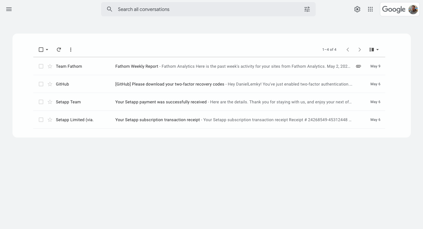
I found the Chrome extension User JavaScript and CSS, installed it and began to modify. The main goal: make Gmail less chaotic. This is what I came away with:

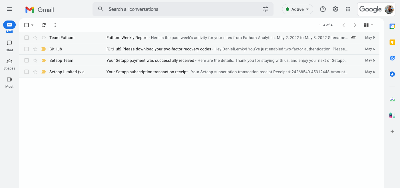
I don’t know about you but I find this to be a massive improvement compared to the default Gmail inbox:

The screenshots show a fairly empty inbox… but I’m sure we all know what Gmail feels like when you have 100+ messages in your inbox with half them unread. It makes you not even want to deal with it. I think this modification helps a lot for that.
The User Javascript and CSS extension allows me to set the CSS to load automatically on this domain so anytime I visit Gmail, it uses my custom styling.
And if for whatever reason I need to revert to the default view, I can toggle the custom CSS off for the page in the extension.

In my opinion – less is more most of the time and more apps could benefit from simplifying their UI rather than putting everything in front of your face. But thankfully with the web and useful extensions, you can make your experience a bit better with things like this.
